
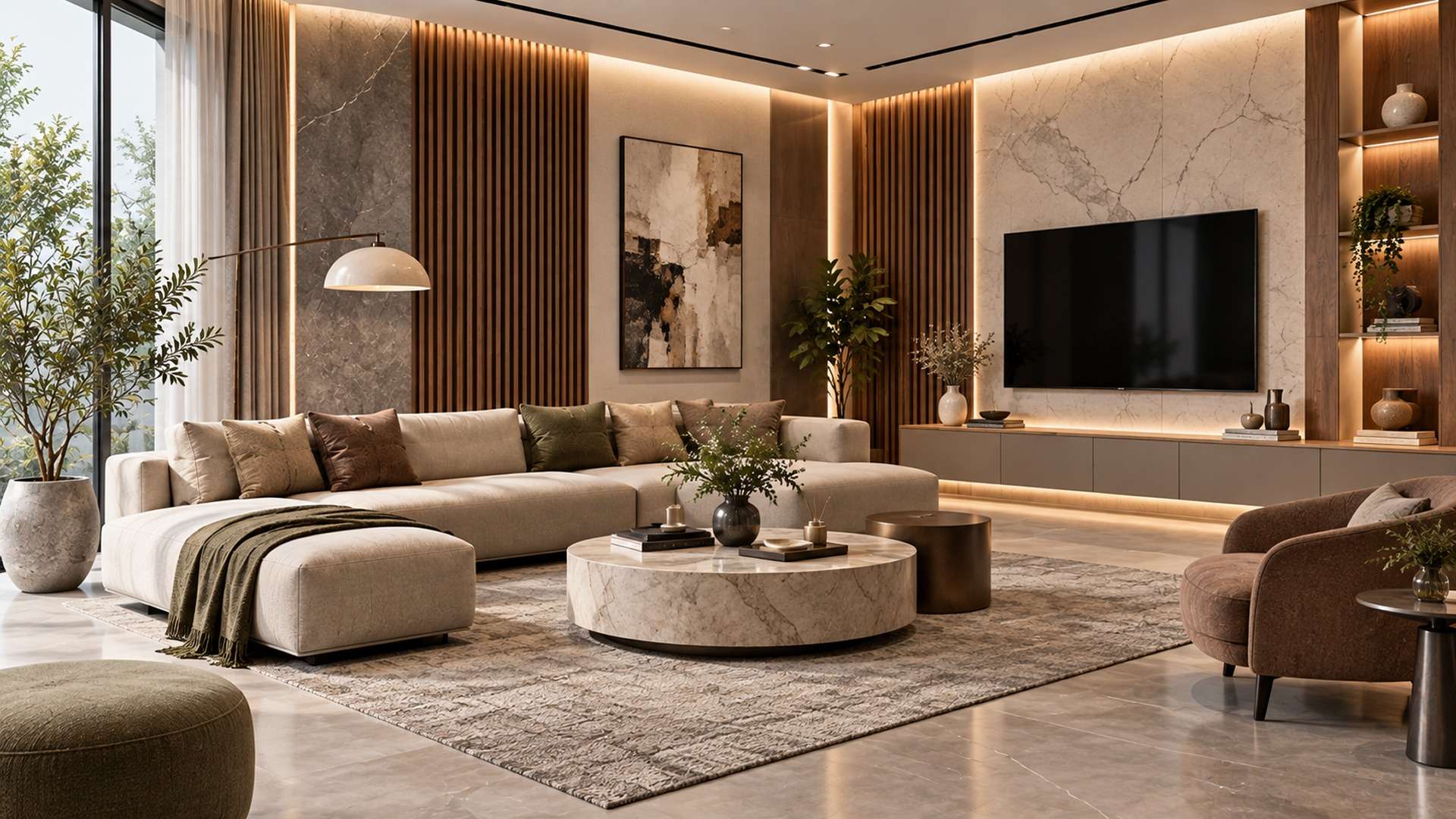
A refined interior rarely comes from choosing one beautiful product or following a single design trend. The character of a space is created through the way surfaces, colours, textures and materials work together. When these elements are carefully balanced, even a simple room can feel considered, comfortable and visually cohesive.
This is where thoughtful interior decoration becomes important. Rather than treating flooring, walls, furniture, sanitaryware, laminates, veneers, hardware and furnishings as separate selections, a well-planned interior considers how every material contributes to the overall experience of the space.
For homeowners, architects, interior designers and builders, the challenge is not simply finding attractive finishes. It is understanding which materials complement each other, how colours behave under different lighting conditions, and where texture should be introduced without making a room feel visually crowded.
At Posh, we believe that refined interiors begin with informed material selection and a clear understanding of how individual design elements come together.
What Makes an Interior Feel Refined?
A refined interior is not necessarily minimal, expensive or highly decorative. It is an interior where the different elements appear intentional.
A room can contain several materials and still feel calm when there is a clear relationship between them. Similarly, a room with very few materials can feel unfinished if their colours, proportions or textures do not work together.
Several principles can help create this balance:
- A controlled colour palette provides visual continuity.
- Contrasting textures add depth without relying on excessive decoration.
- Complementary materials create a sense of cohesion.
- Repetition of selected finishes connects different areas of the room.
- Practicality ensures that design decisions remain suitable for everyday use.
The objective is to create visual interest while maintaining a sense of order.
1. Start with a Surface Palette
Surfaces form one of the largest visual components of an interior. Walls, floors, countertops, cabinetry and other major areas establish the foundation on which the rest of the decoration is built.
Instead of selecting each surface independently, begin by creating a surface palette.
For example, a residential living room could combine a warm wood-inspired finish with a neutral wall surface and a subtle stone-effect element. The materials do not need to match exactly. They simply need to share an underlying relationship in tone, warmth or visual character.
This approach is particularly useful when working with multiple finishes. A wood grain can soften the appearance of a hard surface, while a stone-inspired finish can introduce structure and contrast.
The key is to decide which surface should attract attention and which ones should support it.
Use One Dominant Surface
Choosing one dominant material or finish can give the room a visual anchor. Other surfaces can then complement it rather than competing for attention.
For instance, if cabinetry features a prominent wood grain, flooring and wall finishes can remain comparatively restrained. If the flooring has a strong pattern, simpler cabinetry and wall surfaces may create a better balance.
This hierarchy prevents the space from appearing visually busy.
2. Build a Cohesive Colour Story
Colour is one of the most noticeable aspects of interior decoration, but successful colour planning goes beyond choosing a favourite shade.
A practical colour palette generally considers three levels:
- Base colours create the background of the room. These are often found on walls, larger surfaces or major furniture pieces.
- Supporting colours add variation while remaining visually connected to the base.
- Accent colours introduce controlled contrast through selected furniture, décor, fabrics, artwork or smaller architectural elements.
For example, a neutral foundation can be paired with warm timber tones and a deeper accent shade. The result can feel sophisticated without requiring every element to be the same colour.
Consider Natural and Artificial Lighting
A colour that appears soft and warm during the day may look noticeably different under artificial lighting. This is why viewing samples only in a showroom or under one type of light can sometimes lead to unexpected results after installation.
Before finalising colours, consider:
- The amount of natural light entering the room
- The direction of windows
- Warm or cool artificial lighting
- The size of the room
- The surrounding materials
- The intended atmosphere of the space
Whenever possible, evaluate material samples in the actual environment where they will be used.
3. Combine Textures to Add Depth
Texture is one of the most effective ways to make an interior feel layered and sophisticated.
A room dominated by smooth, reflective surfaces can sometimes feel cold or overly uniform. Introducing tactile materials can soften that effect. Conversely, using too many highly textured finishes can make a space feel cluttered.
The goal is contrast.
A smooth surface can sit alongside a natural-looking wood grain. A matte finish can contrast with a subtle sheen. Soft furnishings can balance harder materials such as stone, glass or metal. The contrast does not always need to be dramatic. Small differences in surface character can create depth without becoming visually distracting.
Think Beyond Visual Texture
Texture is not only about what a material looks like. It also influences how the space feels when people interact with it.
Consider the difference between:
- Smooth and textured finishes
- Matte and reflective surfaces
- Soft and hard materials
- Fine and pronounced patterns
- Natural-looking and highly uniform finishes
Combining these characteristics thoughtfully can give an interior a more complete sensory quality.
4. Mix Materials Without Losing Cohesion
Material mixing is an important part of contemporary interior decoration. Wood, stone, laminates, veneers, metal, glass, fabrics and sanitaryware can all contribute different qualities to a space. However, using multiple materials does not automatically create sophistication.
The materials need a reason to coexist. One useful approach is to repeat a material or finish in more than one location. A timber tone used in cabinetry might appear again in furniture detailing or decorative elements. A metal finish used for hardware could be subtly repeated in lighting or accessories.
This repetition creates continuity.
Create Material Relationships
Instead of asking, “Do these materials match?”, ask:
Do these materials relate to each other?
Two finishes can work together even when they are not identical. They may share:
- Similar undertones
- Complementary textures
- A common level of visual intensity
- Related patterns
- A balanced contrast
This way of thinking allows designers to create interiors that feel curated rather than overly coordinated.
5. Use Laminates and Veneers Strategically
Cabinetry and built-in furniture occupy significant visual space, making their finishes particularly important.
Laminates can offer versatility in colour, pattern and surface appearance, making them suitable for a wide range of applications. Veneers, on the other hand, can bring the visual character of natural wood into an interior.
The right choice depends on the design objective, application, maintenance expectations and overall material palette. Rather than using the same finish everywhere, consider where a particular material will have the greatest impact. For example, a wood-inspired veneer or laminate may be used to visually warm a predominantly neutral space, while a simpler finish can be introduced on secondary cabinetry to maintain balance.
6. Make Flooring Part of the Overall Design
Flooring should not be treated as an afterthought. It influences how every other element in the room is perceived.
A patterned or strongly coloured floor can become a design feature in itself. In such cases, walls and furniture may benefit from quieter finishes. Alternatively, a relatively understated floor can provide a neutral foundation for expressive cabinetry, furniture, wall treatments or décor.
When selecting flooring, consider more than appearance. The intended use of the room, maintenance requirements, durability, movement through the space and relationship with adjacent areas should also influence the decision. For open-plan interiors, continuity between flooring materials can help visually connect different functional zones.
7. Balance Matte and Reflective Finishes
Using different levels of sheen is another effective way to create visual depth. Matte finishes generally provide a softer and more understated appearance, while reflective surfaces can help introduce brightness and visual movement.
A refined space often benefits from a combination of both. For example, matte cabinetry can be paired with a subtly reflective surface, while textured furnishings introduce another layer of contrast. The result is more nuanced than using either completely matte or highly glossy finishes throughout the room.
The amount of reflection should also be considered in relation to lighting. Reflective surfaces can amplify light, while darker matte finishes may absorb more of it.
8. Pay Attention to Hardware and Smaller Details
Small components can have a surprisingly strong influence on the finished interior.
Hardware, handles, fittings, fixtures and other functional elements should support the larger material palette rather than appearing disconnected from it.
For example, selecting a consistent metal finish across cabinet hardware, bathroom fittings and selected accessories can establish subtle visual continuity.
However, consistency does not mean everything has to be identical. Introducing small variations can work when the overall palette remains controlled.
These details are particularly important because they are often experienced at close range.
9. Bring Materials Together in Bathrooms
Bathrooms provide an excellent opportunity to combine surfaces, colours and textures because several material categories come together within a relatively compact area.
A standard bathroom might include wall surfaces, flooring, sanitaryware, fittings, cabinetry, mirrors and lighting.
As the space is usually smaller, material selection needs to be especially deliberate.
A useful approach is to choose one primary surface, one complementary material and a controlled accent. For example, a neutral wall finish can be combined with a subtle stone-inspired surface, warm cabinetry and restrained metal detailing.
The sanitaryware and fittings can then support the overall aesthetic rather than becoming isolated design elements.
Practical considerations such as cleaning, moisture exposure, slip resistance where relevant and long-term maintenance should remain part of the decision-making process.
10. Use Contrast to Create Visual Hierarchy
Contrast is essential for preventing an interior from looking flat.
Contrast can be created through:
- Light and dark colours
- Warm and cool tones
- Smooth and textured finishes
- Large and small patterns
- Soft and hard materials
- Matte and reflective surfaces
The important point is to control the contrast.
If every surface is designed to stand out, nothing becomes the focal point. A better approach is to establish a hierarchy where one or two elements attract attention while the rest provide support.
This is particularly effective in living rooms, kitchens, bedrooms and commercial interiors where multiple materials need to coexist.
11. Think About Adjoining Spaces
One of the most common challenges in interior projects is creating a relationship between connected spaces.
A living room, dining area, kitchen and hallway may each have different functions, but they are often visually connected.
Using a consistent colour family, repeating a material or maintaining similar hardware finishes can help create continuity.
At the same time, subtle differences can distinguish one area from another.
For example, a common flooring treatment can visually connect an open-plan area, while different cabinetry finishes or lighting schemes define individual zones.
This creates a sense of progression rather than making every room feel like a separate design project.
12. Prioritise Function Alongside Appearance
Good interior decoration should look considered, but it should also work for the people using the space.
Before finalising materials, think about how the room will actually be used.
A family living space may need finishes that are easy to maintain. A commercial environment may require materials suited to higher traffic. A bathroom needs materials appropriate for moisture exposure. A kitchen requires surfaces that can handle regular use and cleaning.
This is where professional material guidance can make a difference.
The most attractive finish is not necessarily the right finish for every application. The decision should consider appearance, performance, maintenance, installation requirements and the expected lifespan of the interior.
13. Avoid the ‘Everything Matches’ Approach
One of the easiest ways to make a space feel predictable is to use the same finish, colour and texture everywhere.
A coordinated interior does not have to be identical.
Instead of matching every material, create relationships between them. Introduce variation while maintaining a common visual language.
For example, different wood tones may work together when their undertones are compatible. Similarly, multiple neutral shades can create depth when their textures and proportions are carefully controlled.
The objective is harmony, not uniformity.
14. Create a Material Sample Board Before Finalising
A sample board can be one of the most useful tools during the planning stage.
Bring together representative samples of the materials being considered, such as:
- Flooring
- Wall finishes
- Laminates
- Veneers
- Countertop or surface materials
- Fabrics
- Hardware
- Sanitaryware finishes
- Paint colours
Place the samples next to one another and observe how they interact.
This can reveal clashes that may not be obvious when each product is viewed individually.
It is also useful to check the samples under different lighting conditions and at different times of day. Material colours and textures can appear noticeably different depending on their surroundings and illumination.
15. Work With a Clear Design Direction
Before choosing individual products, define the character you want the interior to have.
It could be warm and contemporary, understated and minimal, natural and earthy, luxurious and dramatic, or a combination that reflects the needs of the project.
Once the direction is clear, every material decision becomes easier to evaluate.
Ask of each proposed finish:
Does it support the overall design direction?
If the answer is no, reconsider whether it is necessary, even if the material looks attractive on its own.
This simple discipline can prevent unnecessary additions and help maintain a coherent final result.
Interior Decoration Is About Relationships, Not Individual Products
The most successful interiors are rarely defined by one material. They are defined by relationships.
- The relationship between a wall and a floor.
- Between a wood finish and a stone surface.
- Between a matte cabinet and a reflective detail.
- Between a neutral background and a carefully selected accent colour.
- Between aesthetics and everyday functionality.
When these relationships are considered during the planning stage, the result can feel significantly more intentional.
At Posh, the idea is to approach interior materials as part of a larger design story rather than as isolated selections. From surfaces and laminates to veneers, sanitaryware, hardware, furnishings and décor, every element has a role to play in shaping the character of a space.
Key Takeaways
Thoughtful interior decoration is ultimately about finding the right balance between visual appeal, material character and practical use.
Start with the major surfaces, establish a controlled colour palette, introduce texture gradually and select materials based on how they interact with one another. Consider lighting, maintenance and functionality before finalising your choices, and use samples to evaluate the complete combination rather than judging materials individually.
A refined interior does not need to be overloaded with finishes or decoration. It needs a clear design direction and carefully considered details.
When surfaces, colours, textures and materials are brought together with purpose, the result is a space that feels cohesive, distinctive and comfortable to experience.